About:

PayPal is a widely used online payment platform that facilitates secure transactions and money transfers.

Challenge:

Unclear fees, account linking and a confusing flow that reduced user confidence during P2P transactions.

Impact:

I reduced confusion, improved fee clarity, and increased users’ confidence in completing P2P transactions. 

Role:

User research & analysis
UX and UI redesign
Design library kit
Usability testing

Industry:

FinTech

Time:

Oct 2024 – Nov 2024

Conversion (CR)

Led to a marked increase in successful payment confirmations.

Abandonment (CAR)

Decreased user exit during the process.

Time to Completion

Resulting in a vastly more efficient user experience.

Trust & Clarity

Boosted user satisfaction and confidence.

How it started…

A single tweet sparked our journey to uncover if there’s a real issue with PayPal.

So, we decided to dig deeper

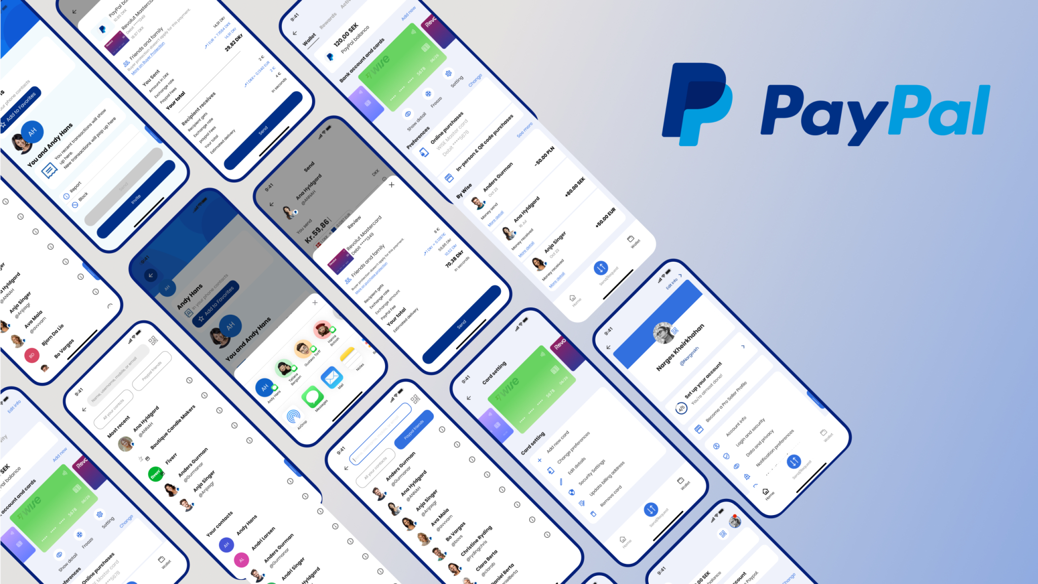
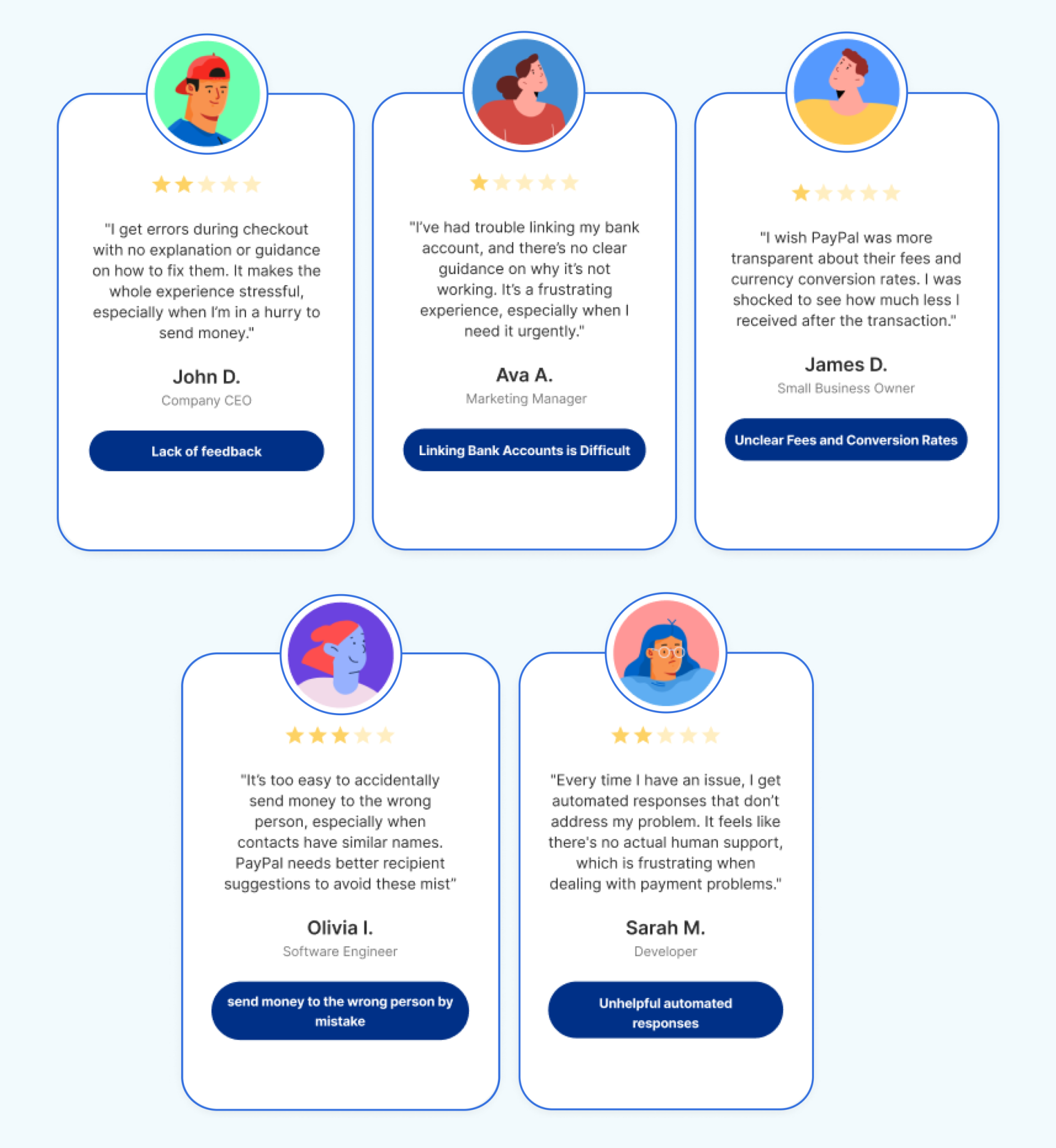
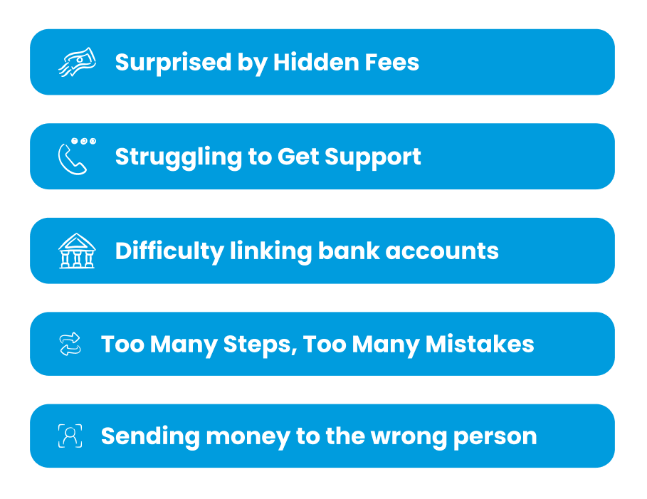
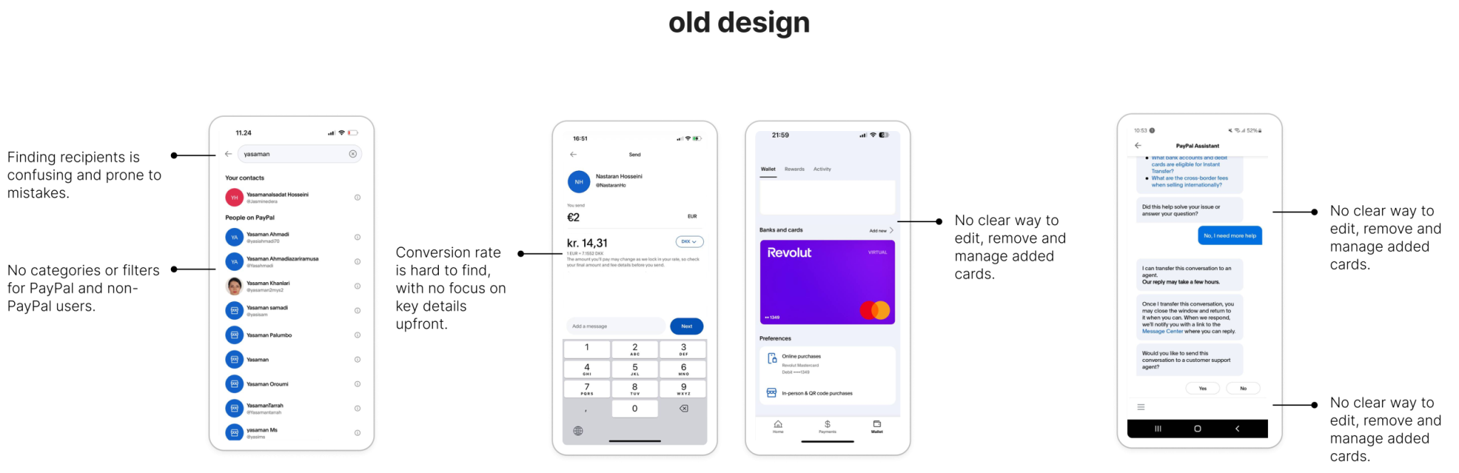
While PayPal is known for its simplicity and security, it struggles with limited guidance, challenges in linking bank accounts, unclear fees and conversion rates, and the risk of sending money to the wrong person. Additionally, the automated customer support provides little assistance.

We needed to know

  • Who uses PayPal’s P2P services, and how often?
  • What challenges do users face when completing transactions?
  • What alternative apps do users prefer, and why?
  • Why do users abandon a transaction midway?
  • How do users feel about contacting PayPal support?
  • How do users feel about the clarity of PayPal’s fee structure?

People who’ve used PayPal for a few years want clear information about fees. They like it when the app is simple, fast, and helps them feel in control, especially when sending money abroad.

When it comes to money, people expect every interaction to be clear, reliable, and stress-free.

What we found 🤔

Users face unexpected friction that disrupts their flow and confidence. This creates hesitation and reduces their overall satisfaction, limiting  engagement.

Who leaves and Why?

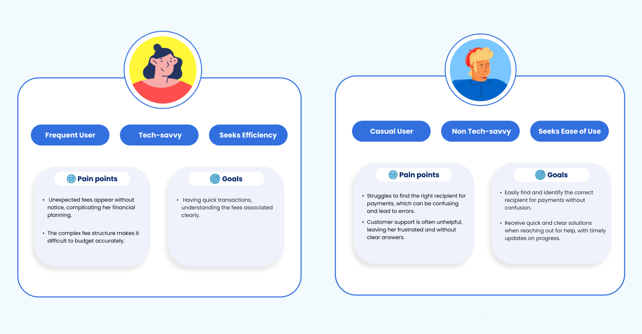
Two very different people face their own challenges and have unique needs. Their priorities reveal where real impact happens and what we should focus on.

Looking at what exists

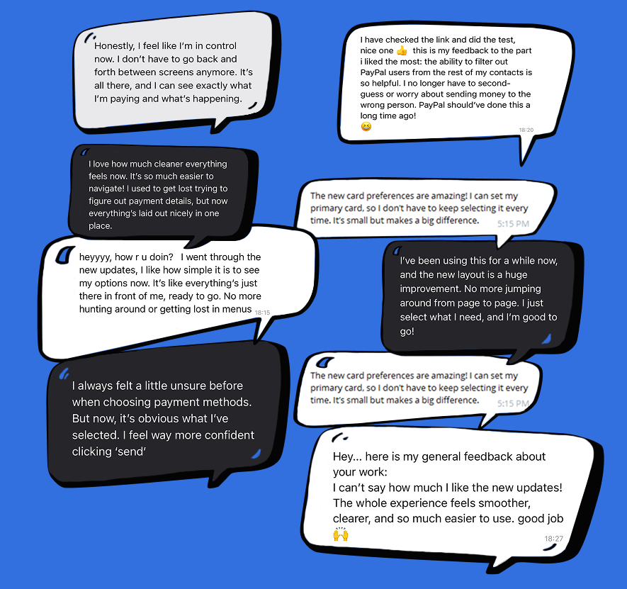
Users are already trying to make things work with what’s available but they often feel stuck, frustrated, or let down. 

What’s already out there 🧐

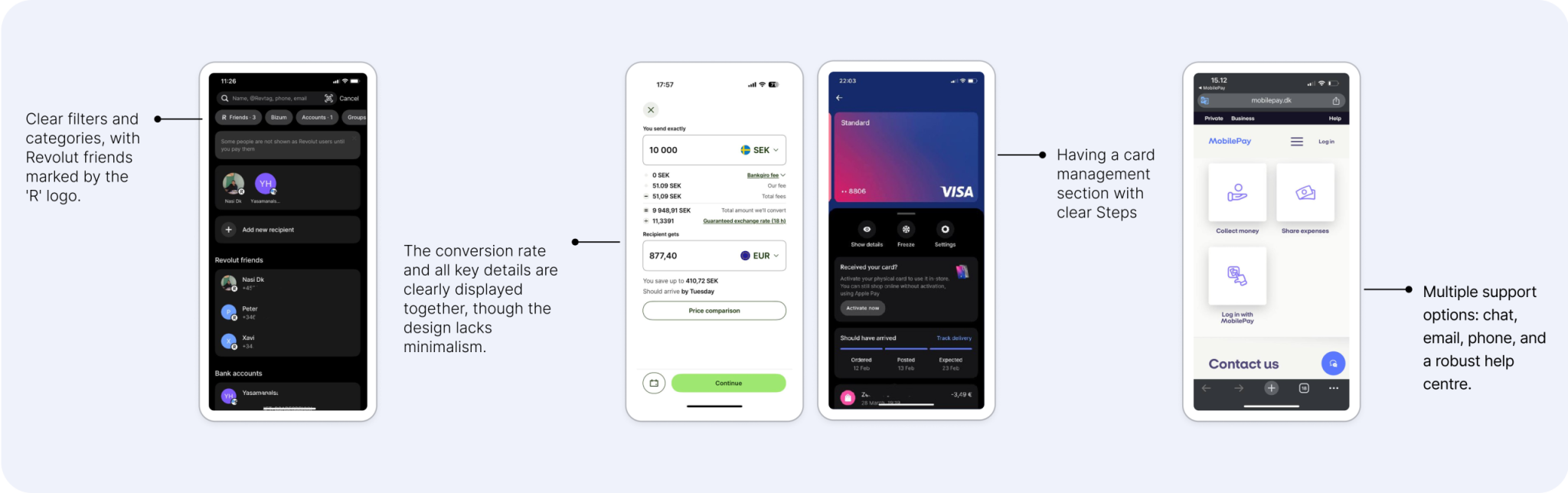
PayPal’s peers face similar challenges!
some meet user needs with clarity, others fall short. These patterns reveal what users expect and where there’s room to do better.

The peers prioritize simplicity and transparency with intuitive navigation, clear information display, and multiple support options.

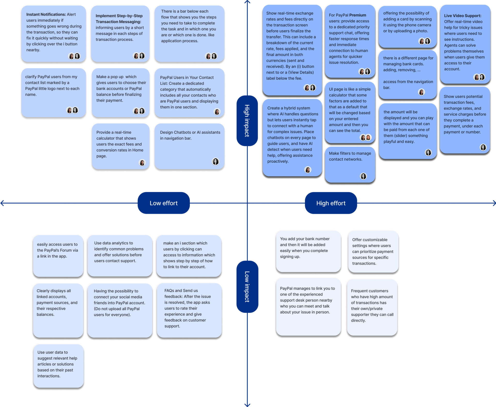
Areas for improvements

We looked at what existed and how others handled similar issues. From this, a clear question came up that helped us focus and think in new ways. It showed us a better path forward.

  • ➖ Recipient search

    How do we simplify finding recipients to ensure a seamless transaction experience?

  • ➖ Transparency

    How do we clarify conversion rates & fees so users know the exact amount sent or received?

  • ➖ Managing account

    How do we simplify linking bank accounts & managing sources for confident financial management?

What should we build first?

We focused on ideas that could make the biggest difference. Bringing different perspectives together helped us find the most valuable solutions faster.

Turning challenges into solutions

We approached each challenge as a chance to think differently. 

Solution 1:

Simplifies this with categorized contacts, smart suggestions, and a dedicated filter for PayPal users, making the process seamless and stress-free.

“I want to find the person I’m paying quickly without any hassle.”


Solution 2:

A detailed summary shows live exchange rates, transparent fees, and the exact amount the recipient will receive; all before confirming the transaction.

“I want to know exactly how much I’m sending and what it will cost me.”


Solution 3:

Integrates card management into the wallet, allowing users to link bank accounts, manage payment methods, and update preferences effortlessly in just a few clicks.

“I want an easy way to link my accounts and keep my payment options organized.”


Solution 4:

A support system with instant chat access, categorized issues for faster navigation, and an intuitive help center that solves problems effortlessly.

“I want quick and easy support when I face an issue.”


Solution 5:

Delivers real-time alerts with straightforward instructions, ensuring users are informed of any issues or missing steps, making the resolution process quick and easy.

“I want clear guidance when issues arise or steps are missed.”

Did we solve the problems?

The changes we made really improved what existed, and we felt we were getting closer to our goals. The transaction process now feels clearer, making the payment experience better.

But, are we really getting it right? Let’s test!

Refining What Matters

Users showed us where things felt confusing or limiting. We made key changes that simplify actions, reduce friction, and better match what they need in the moment.

And guess what?

we were surprised by what users told us 🎉

Users are excited about the updates, feeling more confident, secure, and supported with PayPal’s latest improvements! 

What we've learned:​

we were surprised by what users told us 🎉

Users are excited about the updates, feeling more confident, secure, and supported with PayPal’s latest improvements! 

  • ➖ Fee transparency

    Users just want to know what they’ll pay. No surprises. Hidden fees break trust. Keep it simple, clear, and upfront. It makes all the difference.

  • ➖ Clear customer support is key to building trust in financial app

    When it comes to money, support matters. Users need to feel heard, helped, and confident their concerns are handled with care.

  • ➖ PayPal efficiency is missing on P2P experience

    In digital payments, speed and ease aren’t optional. They’re expected. Users want quick, simple transactions they can trust. A smooth experience keeps them coming back.

Scroll To Top