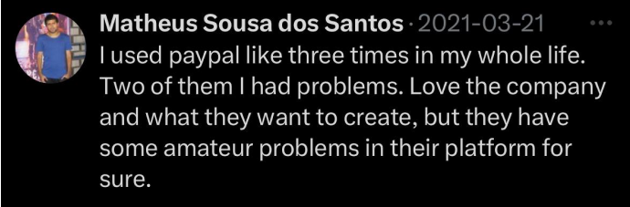
How it started…
A single tweet sparked our journey to uncover if there’s a real issue with PayPal.
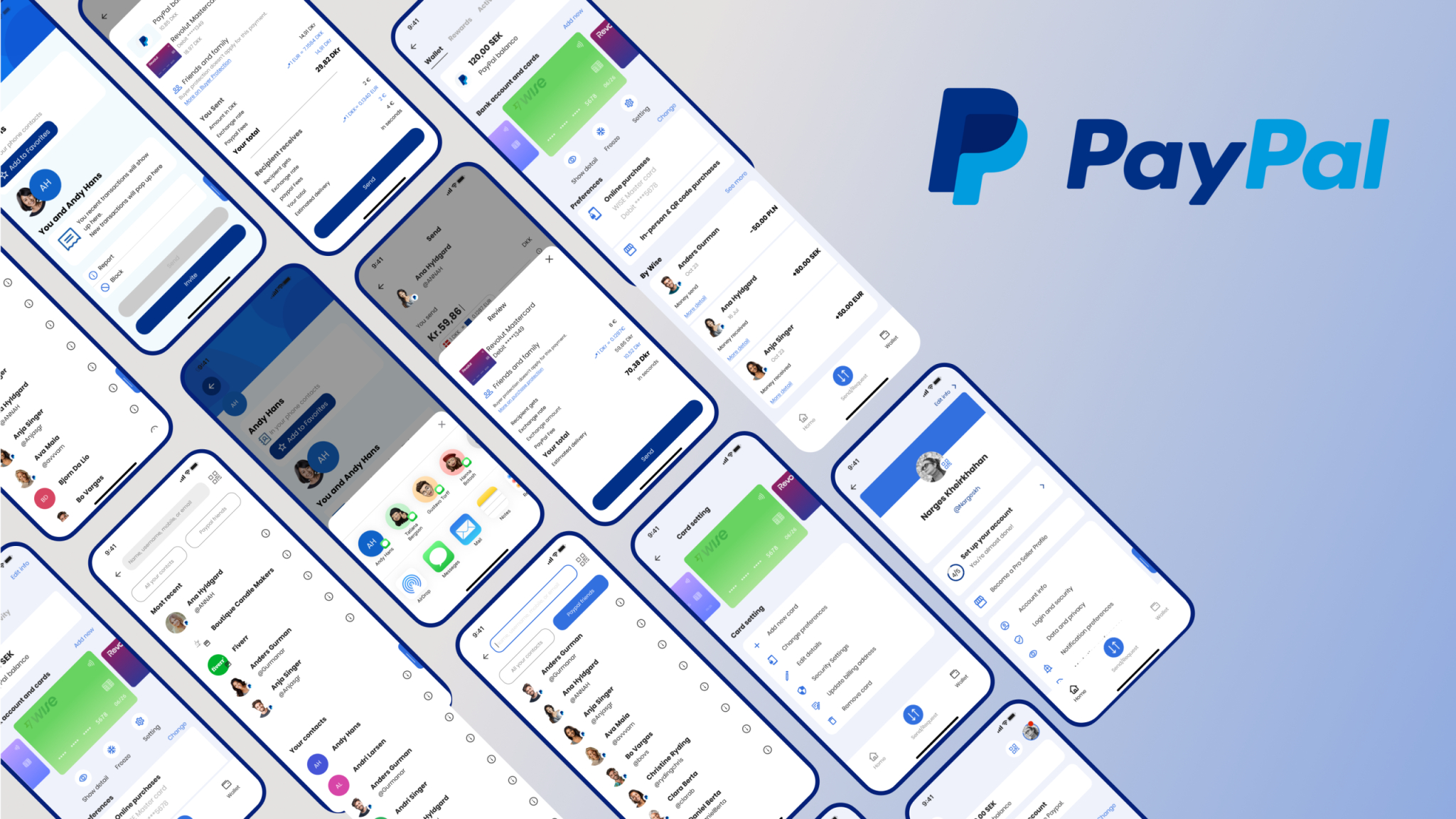
We decided to dig deeper
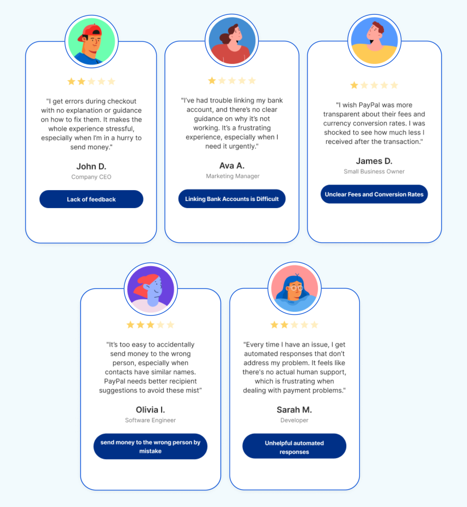
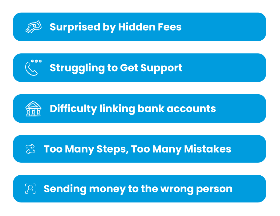
While PayPal is known for its simplicity and security, it struggles with limited guidance, challenges in linking bank accounts, unclear fees and conversion rates, and the risk of sending money to the wrong person. Additionally, the automated customer support provides little assistance.
When it comes to money, people expect every interaction to be clear, reliable, and stress-free.
Users face unexpected friction that disrupts their flow and confidence. This creates hesitation and reduces their overall satisfaction, limiting engagement.
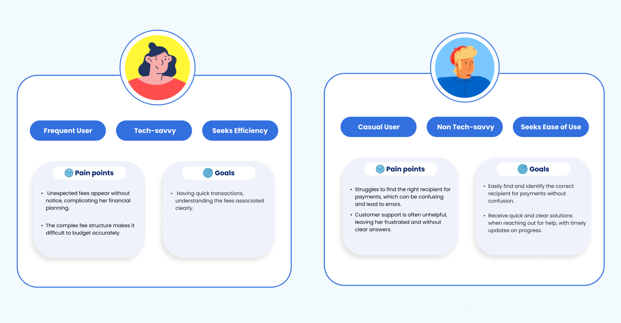
Two very different people face their own challenges and have unique needs. Their priorities reveal where real impact happens and what we should focus on.
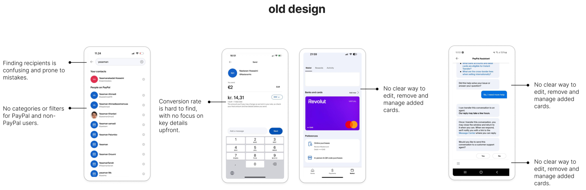
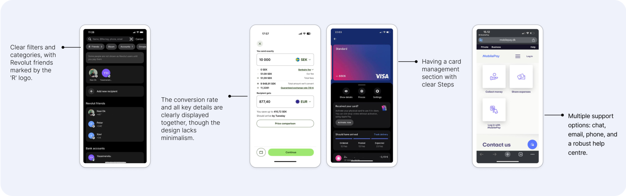
Looking at what exists
Users are already trying to make things work with what’s available but they often feel stuck, frustrated, or let down.
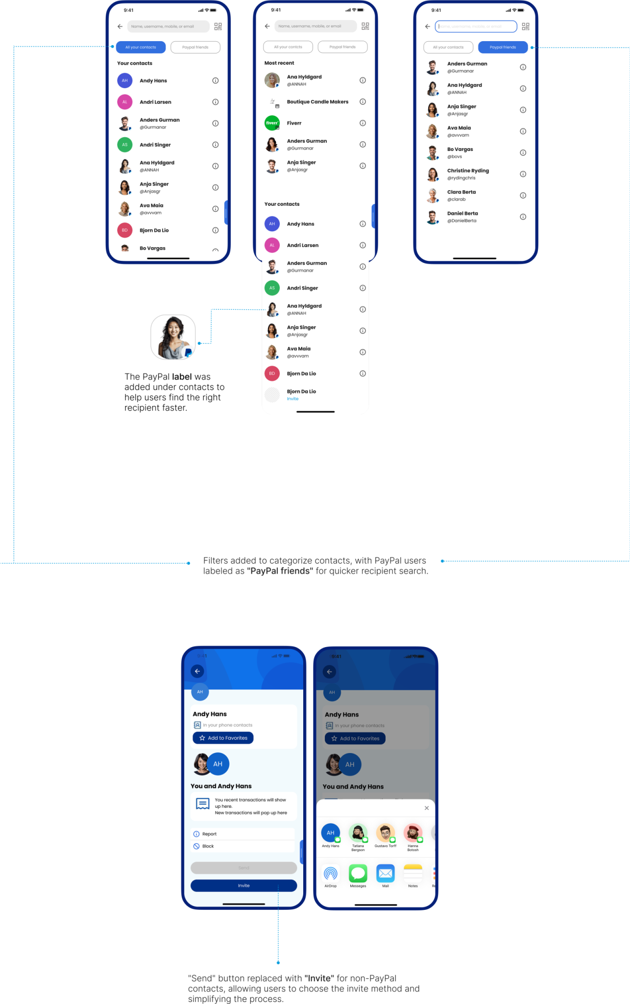
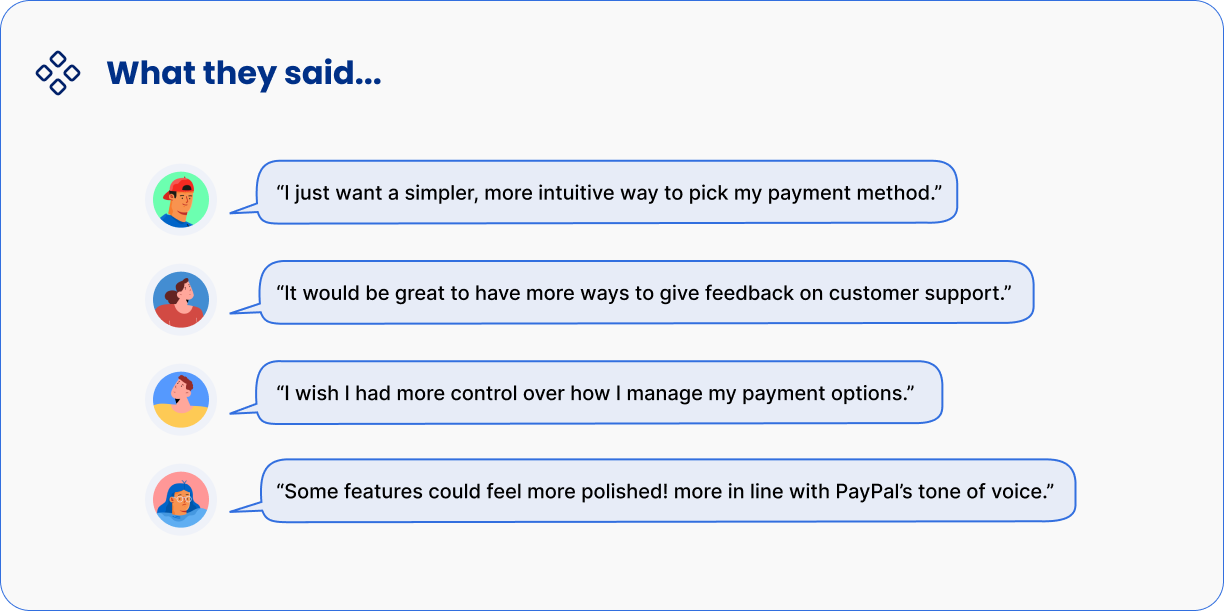
“I want to find the person I’m paying quickly without any hassle.”
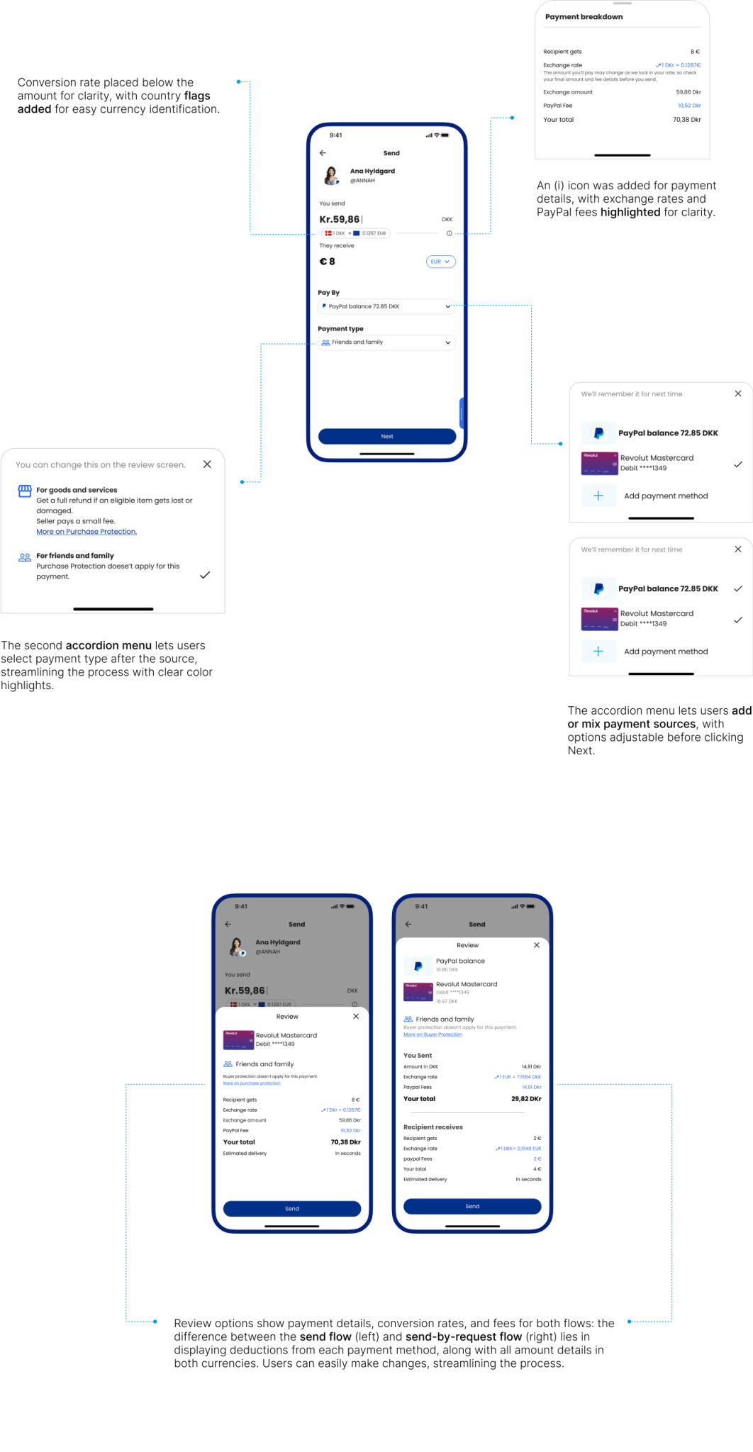
“I want to know exactly how much I’m sending and what it will cost me.”
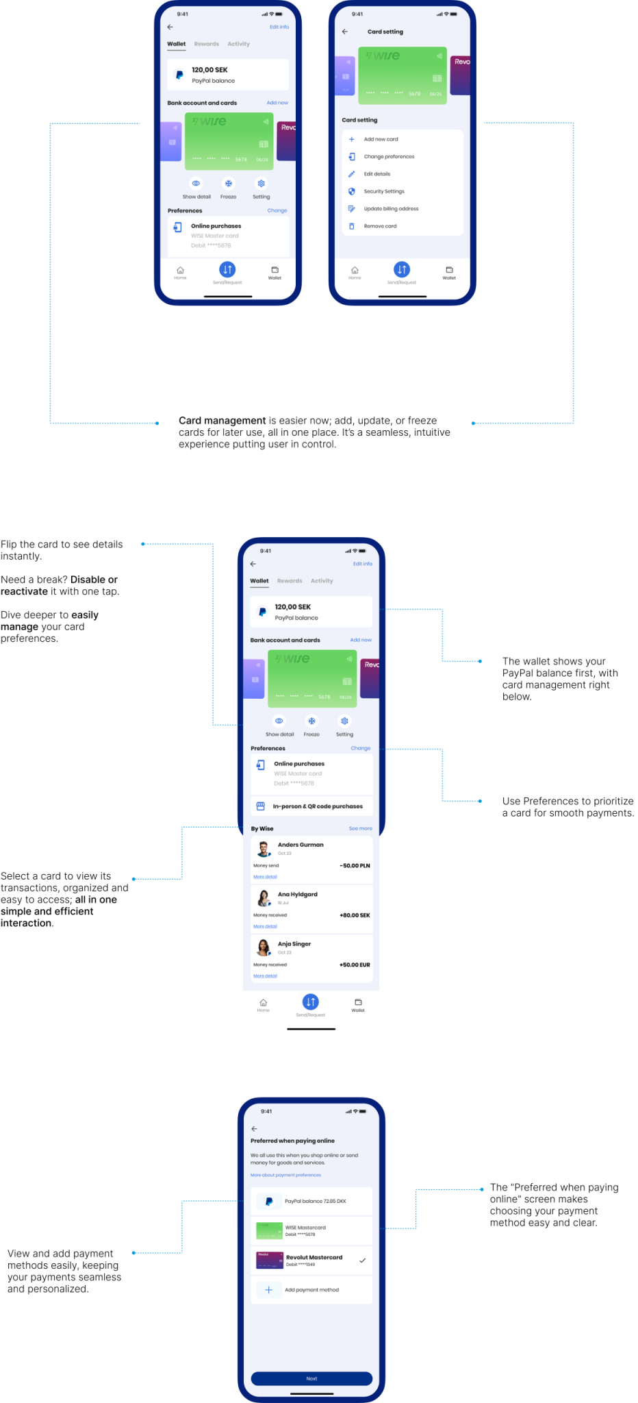
“I want an easy way to link my accounts and keep my payment options organized.”
“I want quick and easy support when I face an issue.”
“I want clear guidance when issues arise or steps are missed.”
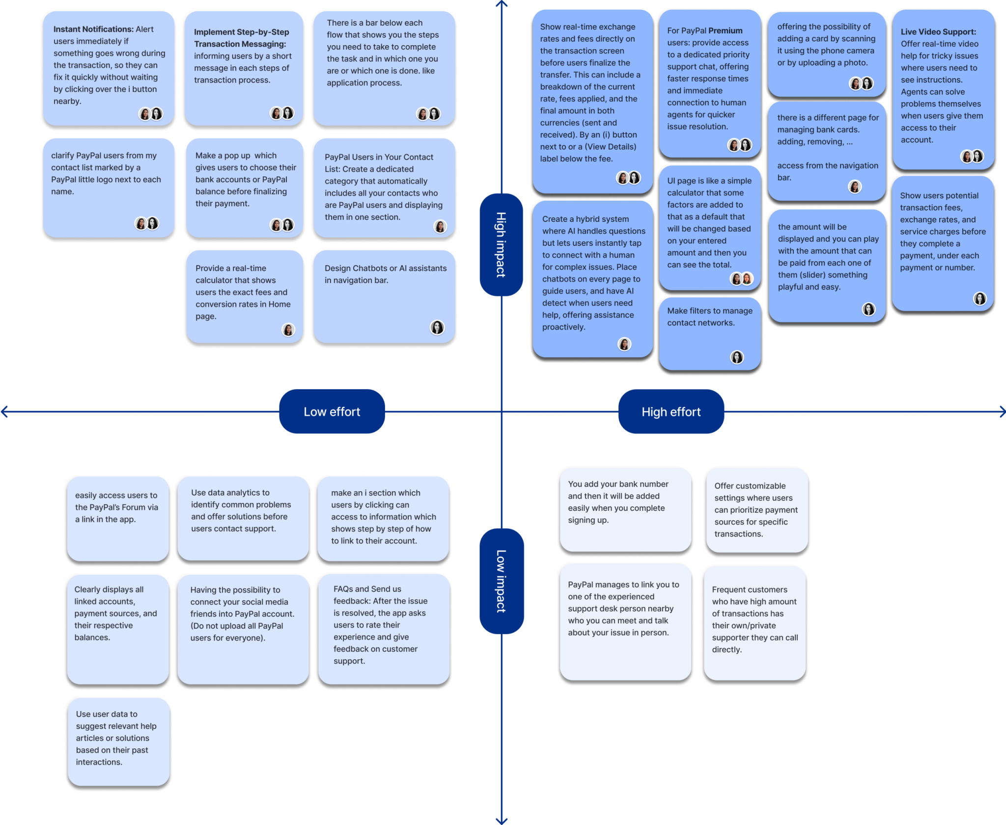
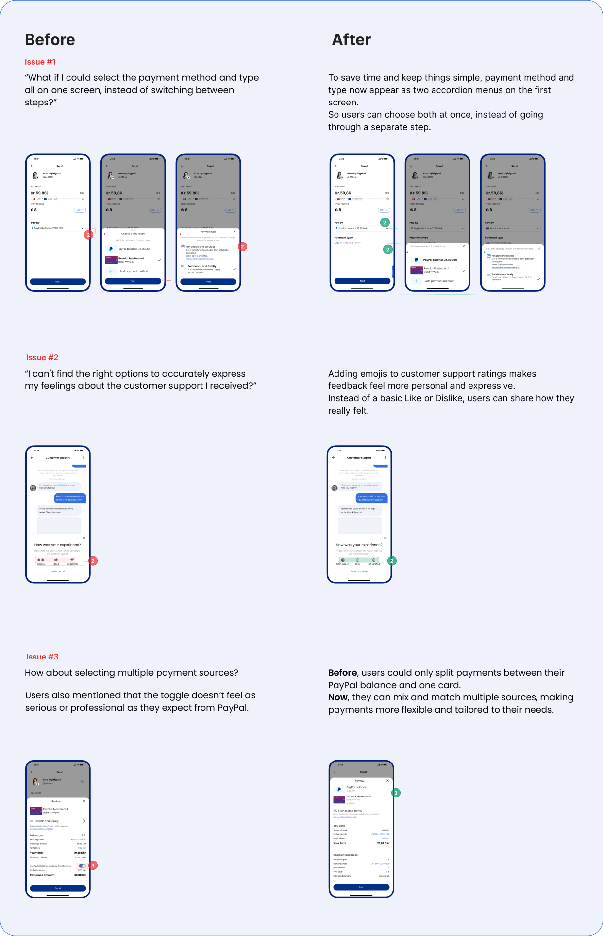
- Fee transparency
Users just want to know what they’ll pay. No surprises. Hidden fees break trust. Keep it simple, clear, and upfront. It makes all the difference.
- Clear customer support is key to building trust in financial apps:
When it comes to money, support matters. Users need to feel heard, helped, and confident their concerns are handled with care.
- PayPal efficiency is missing on P2P experience:
In digital payments, speed and ease aren’t optional. They’re expected. Users want quick, simple transactions they can trust. A smooth experience keeps them coming back.
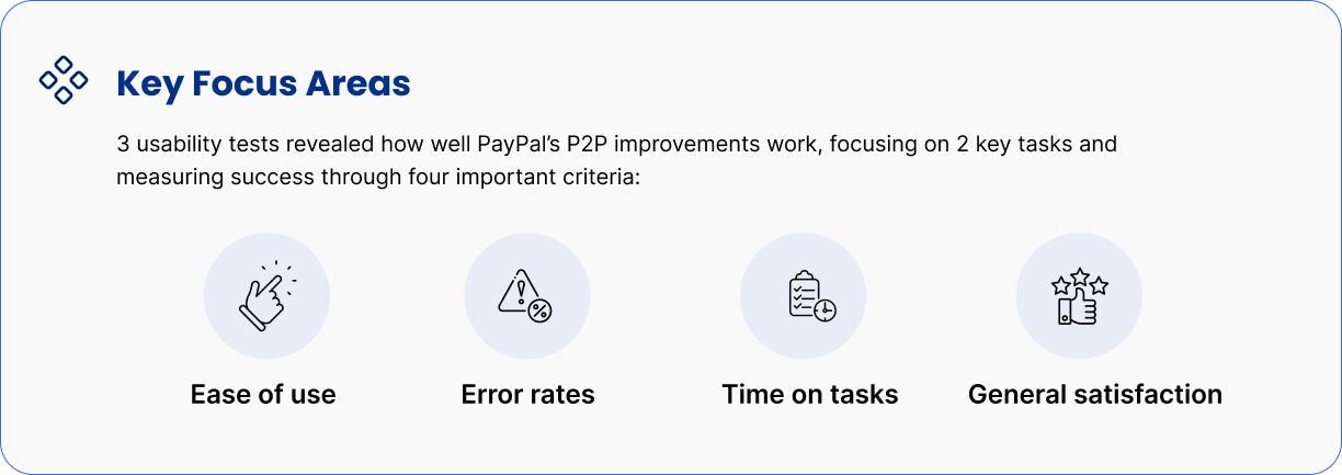
– Test early with real users to quickly validate ideas, no need for complex prototypes right away. It saves time and sharpens the design.
– Add simple personalization. Let users choose how they view fees or tweak their payment flow. Small touches, big value.